
Ever wonder if your customer data is whispering a hidden story? Many companies overlook the small clues tucked away in raw numbers, missing a real chance to grow. Imagine turning everyday figures into clear insights that spark smart, quick moves. Best practices in consumer insights reporting show you how to mix solid data with a down-to-earth story that energizes your strategy. In this post, we break down simple ways to transform feedback and stats into a step-by-step roadmap, helping you and your team move closer to success, swiftly and with confidence.
Key Foundations for Consumer Insights Reporting
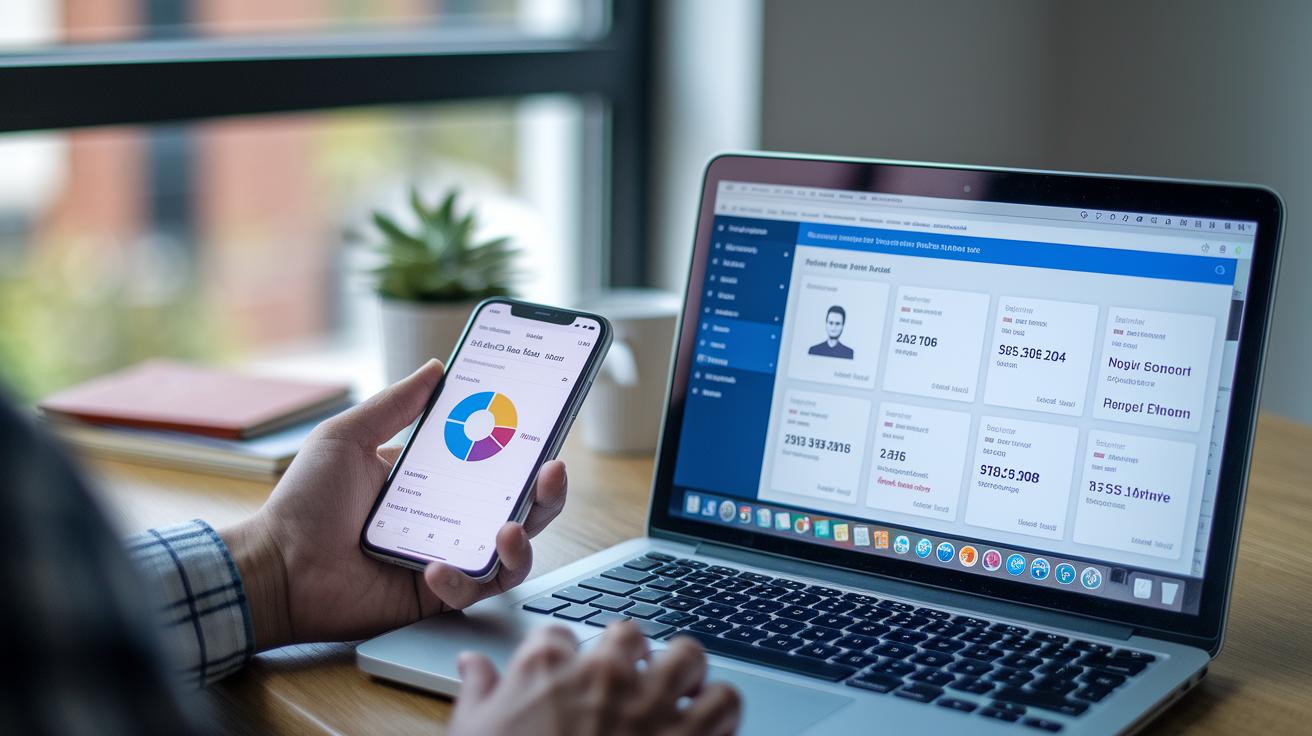
Good reporting starts with solid data know-how. It all begins by setting clear goals and thinking about who will use the report and the decisions it should support. Imagine gathering bits like social media buzz, website traffic, and survey feedback, then blending them into one clear dashboard. When your research methods and analytics follow the same standards, your dashboards really show what matters.
Storytelling transforms plain data into real-life lessons. When you make your customers the heroes of the story, numbers become relatable. Picture a quick snippet saying, "Imagine a customer whose experience flipped a struggling campaign: her story highlighted issues and unlocked opportunities." This personal touch makes the insights stick, much like that famous study where 63% remembered a good story versus only 5% recalling a lone statistic. In short, mixing narrative with clear analysis speeds up smart decisions.
The DIKW model shows us how to turn raw numbers into real wisdom. You start with basic data, then work it into useful information and key insights through careful analysis. With the global customer experience (CX) platform market set to reach $14.45 billion by 2025, blending business sense into your reports is more important than ever. This method not only brings critical data points and stakeholder priorities into focus, it can also boost decision-making speed by up to 30 times, fueling growth and better performance.
Structuring Your Consumer Insights Report for Maximum Clarity

When you organize your consumer insights, it feels like you’re having a clear chat with a friend over coffee. A clean layout guides busy decision-makers through layers of data without overwhelming them. Keep it simple and straightforward so the report reads like a friendly update rather than a heavy textbook.
Start with an Executive Summary. This short snapshot should tell readers what the report is about, its range, and the key takeaways. For instance, you might write, "This overview shows how recent tweaks boosted user engagement and customer loyalty."
Next, share the Methodology. Explain where your data comes from and how you collected it, big surveys, one-on-one interviews, social media tracking (monitoring online chatter), and web analytics. Think of it like sharing your secret recipe: every ingredient matters.
Then, outline the Key Findings. Break down the major themes, such as customer pain points, what they prefer, and emerging behavior trends. Imagine sorting items in your grocery basket; it makes the complex data easy to digest.
Finally, offer Actionable Recommendations. Give clear next steps that fit with your goals. For example, you might say, "Adjust the content strategy to highlight authentic user testimonials that really click with customers."
Using short paragraphs and a few bullet points here and there makes the report easy on the eyes. Place key metrics in the top-left corner, since that's how we naturally scan a page. Bold, high-contrast fonts paired with eye-catching graphics will keep the message sharp and memorable.
Visual Analytics Best Practices in Consumer Insights Reporting

Visuals bring data to life, they tell the story behind the numbers in a way that feels clear and real. They take raw figures and shape them into engaging narratives that help spark smart decisions. With the right charts and graphics, even complex data feels accessible, letting everyone quickly pick up on the important trends and connections.
| Chart Type | Best Use Scenario |
|---|---|
| Bar/Column | Comparing values across categories |
| Pie/Stacked Bar | Understanding parts of a whole |
| Histogram/Box Plot | Revealing data distribution and outliers |
| Line | Displaying trends over time |
| Scatter | Examining relationships between variables |
Interactive elements are a game changer in dynamic insights reporting. Before diving into design, set clear dashboard goals and pinpoint your core metrics to keep things on track. Look for infographics with simple, clear labels that let users quickly connect the dots. And when you add real-time monitoring, your static charts turn into tools that adjust on the fly as new data comes in. This seamless touch makes it easier for decision-makers to catch and act on market shifts as they happen.
Ensuring Data Quality and Research Rigor in Insights Reports

Optimizing Survey Design
When you design a survey, starting with clear, straightforward questions is key. Think of it as setting the stage for genuine insights. You might ask, "On a scale of 1 to 5, how would you rate your experience?" This simple question lets people share their feelings without any hassle. Next, mix in sampling techniques that capture a range of views. Try combining surveys, interviews, focus groups, and even automated call transcriptions to get that complete picture of customer sentiment. Tools like Consumer insights tools (which help gather and analyze feedback quickly) further smooth the process. It’s like crafting the perfect playlist, each element adds to the overall vibe.
Ensuring Data Accuracy
Nothing beats double-checking your work. Run validation checks, compare information from several trusted sources, and keep an eye out for any odd details. Imagine confirming a fact by looking at multiple sources; every extra step builds more trust in your results. Methods like data triangulation (using different data sets to confirm an answer) help reconcile varied outcomes. Plus, AI-powered call analytics can show you both hidden sales chances and areas needing improvement, while also flagging unusual data. In short, every data point is like a puzzle piece, and making sure they all fit ensures your report is spot on.
Ethical and Privacy Compliance
Working with consumer data demands respect and care. Always start with a clear consent process and be open about how you plan to use the information. It’s vital to anonymize data so that people's identities stay safe, and to use robust storage methods to protect sensitive details. Following these practices not only meets industry standards but also builds strong trust with your audience. When you honor ethical guidelines, your report becomes a true reflection of the consumer voice and can drive genuine growth with confidence.
Tracking Performance Metrics to Drive Decision-Making

Getting your key metrics to line up with your business goals is the first step in turning raw numbers into clear, actionable insights. When your indicators reflect what matters most to your company, every chart and dashboard becomes a helpful guide for making smart choices. One marketing team, for example, honed in on what really powered their growth. They shared, "Our self-service portal cut support tickets by 70%," showing that focusing on the right numbers can spark a quick return on investment. Every bit of data in your dashboard then plays a part in guiding your overall strategy.
Here’s a quick breakdown of the most important metrics you might track:
- NPS (Net Promoter Score): This simple survey tells you how likely a customer is to recommend your service to a friend.
- CLV (Customer Lifetime Value): A look at the long-term revenue each customer might bring in, which helps shape retention plans.
- Churn: Keeping tabs on the number of customers who leave can help you tweak your retention efforts.
- Sentiment score: This captures overall customer feelings based on their feedback, shining a light on areas that might need improvement.
- Conversion rate: A way to see how well your efforts are turning prospects into customers, think of it like checking the health of your sales funnel.
- Engagement level: Measures how often and how intensely customers interact with you, showing if your messaging really resonates.
Next, think about how you share these insights with key stakeholders. Imagine starting a report with, "Real-time monitoring shows a significant boost in engagement this quarter." It grabs attention right away. Pair dynamic, high-contrast dashboards with clear, straightforward narratives to help decision-makers quickly grasp what the data is saying. Advanced tactics like predictive marketing analysis (a method that uses past data to forecast future trends) can also help you stay ahead, adjusting strategies on the fly. With each metric tailored to your specific goals, your reporting transforms data into smart, flexible action.
Case Studies Demonstrating Consumer Insights Reporting Best Practices

At one hormone clinic, they wanted to boost patient engagement while fine-tuning how they reached out. They rolled up their sleeves and used things like patient surveys, one-on-one chats, and clear trend visuals (think of it as a snapshot of feedback) to see what needed work. By telling the stories behind the numbers with real patient experiences, they turned raw data into steps that everyone could follow. The result? A noticeable jump in engagement and a more nimble way to meet patient needs.
Then there was another project aimed at a global customer experience platform that could hit $14.45 billion by 2025. This team dove deep into understanding client behaviors and how people saw their brand. They packed their reports with vibrant dashboards and storytelling touches inspired by a well-known Stanford study to really catch the attention of busy execs. This approach led to quicker, smarter decisions and helped the team adjust their strategy on the fly.
Both cases show that mixing genuine client stories with solid data and vibrant visuals clears up complex details and sparks immediate action. When you blend narrative design with thorough analysis, your reports not only inform but also drive real business growth.
Final Words
In the action, we broke down the framework behind consumer insights reporting. We covered everything from setting clear objectives and aligning visuals with narrative flow to ensuring data quality and tracking performance metrics. Each element plays a role in turning raw data into a compelling story that drives decisions. Remember, the right mix of narrative and structure can greatly improve report clarity. Embrace consumer insights reporting best practices to turn insights into innovation and keep your strategies sharp.
FAQ
FAQs
What are consumer insights reporting best practices examples?
Consumer insights reporting best practices examples show how clear narratives, structured frameworks like DIKW, and engaging dashboards drive smart business decisions. They highlight real cases that humanize data to create a relatable story.
How can companies ensure the accuracy of market research data?
The way companies ensure market research data accuracy is by applying validation checks, using triangulation techniques, and gathering feedback from surveys and interviews. These methods build trust in the data.
What does gathering insights mean?
Gathering insights means collecting information from customer interactions, feedback, and trending behaviors, then blending it into a clear picture of market needs that helps steer effective business strategies.