
Ever wondered how smart brands seem to know exactly what you need? Think of a consumer insights dashboard as your go-to hub for all your data. It takes messy numbers and turns them into simple, eye-catching visuals so you can see trends as they happen. This tool really shows you what drives customer loyalty and growth. In this post, we'll dive into how turning scattered data into clear, actionable insights can ignite growth and keep your marketing on track.
consumer insights dashboards: Spark Smart Growth

Consumer insights dashboards are like a busy control hub that brings all your consumer data together in one interactive view. They mix different streams of information into clear, easy-to-read visuals, making it simple for marketing pros to see what’s really going on with consumer behavior. Think of it as a command center where everything from attracting new users to keeping them around adds up to tell a clear, personal story. For instance, you might see a bold graphic of your key growth metric (often known as the North Star Metric), which quickly shows which marketing moves are really making a difference.
These dashboards offer real, practical benefits like quick, actionable insights, live analytics, and even tools to predict future trends. They take messy, raw data and turn it into visual hints that help teams spot opportunities fast and fix issues before they become big problems. Imagine glancing at a heatmap that highlights a drop in user engagement right away , prompting you to tweak your strategy on the spot. It’s like having a built-in early warning system that senses changes before they hit your bottom line, giving your team a real competitive boost.
Key features include smooth AI integration, easy-to-read visuals, and a step-by-step rollout plan. Modern dashboards use AI-powered tools (think of them as smart assistants that spot patterns and predict trends) to shift you from reacting to problems to actively steering your strategy. The journey starts with tracking main numbers like user sign-ups, activations, and retention, then moves to a stage where these numbers tell the full story of your customer’s journey. Finally, every piece of data is fine-tuned to match clear business goals, turning everyday consumer data into rock-solid strategies for smart growth.
Consumer Insights Dashboards Design Best Practices
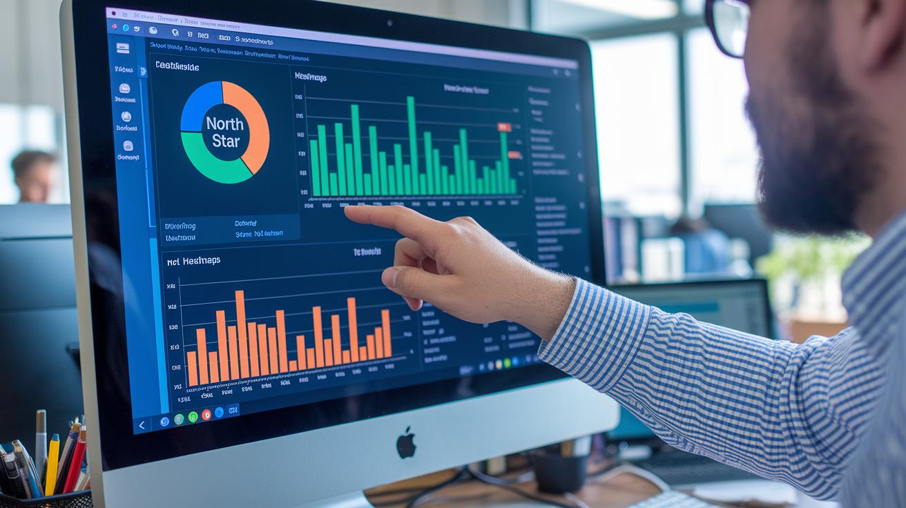
Begin with the big questions that drive your business. For example, ask yourself, "Which acquisition channel brings the highest lifetime value?" This simple question helps you zero in on the exact data you need to shape your strategy.
Next, tie your metrics to every step of the customer journey, especially that very first touchpoint. Think of it like drawing a map where early interactions smoothly transition into long-term engagement.
Keep your visuals clear and striking. Use a standout metric display, like a North Star metric, or retention heatmaps that instantly tell you how things are going. Avoid muddled charts that leave you scratching your head, go for bold, easily digestible graphics.
Stick to a four-step process: establish your core tracking, build a story with segmentation and cohort analysis (grouping similar users together), boost insights with AI-powered anomaly detection, and then fine-tune your approach. When it’s time to pick your dashboard platform, look for tools labeled "Consumer Insights Tools" that offer both flexibility and a powerful impact.
Top Visualization Tools for Consumer Insights Dashboards

When checking out visualization tools, it's all about ease of setup, live analytics, strong big data processing (think crunching large amounts of data effortlessly) and smart predictive insights. It's like planning your favorite playlist; each feature is a track that builds the perfect experience.
Start with a tool that makes dashboard creation a breeze. For example, Upsolve AI offers a no-code, drag-and-drop builder that's great for startups, even if its cost might be a pinch for early budgets.
Next, consider tools that dig deeper into user behavior. UXCam lets you watch session replays, see heatmap analysis, and track custom events. This gives you a clear picture of how people use your app, almost like watching customers interact in real time.
Use this handy checklist to see which tool fits your team’s needs best.
| Tool Name | Key Features | Ideal Use Case |
|---|---|---|
| Upsolve AI | No-code, drag-and-drop builder; AI-driven automations | Rapid dashboard creation; perfect for startups and small teams |
| UXCam | Session replays; heatmap analysis; custom event tracking | Mobile app analytics; teams looking for detailed user behavior insights |
When picking the right platform, think about your budget, how well it integrates with your current systems, and whether it can grow with you. Picture a lean startup that values speed and simplicity, Upsolve AI might be the go-to to set things up fast. In contrast, a larger team focused on mobile trends might lean toward UXCam for its in-depth view of session patterns and engagement.
By balancing costs with handy features, you can choose a platform that suits your current needs and scales as your business evolves.
Key Metrics for Consumer Insights Dashboards

Building an effective consumer insights dashboard starts with choosing the right metrics. In today’s competitive market, each number linked to customer actions turns raw data into clear signals for your business. Whether you're checking customer satisfaction or boosting loyalty, every metric shares a glimpse of user behavior and business performance.
- Cohort retention rate
- Customer lifetime value (LTV – the total value a customer brings over time)
- Churn rate
- Net promoter score (NPS – a quick way to gauge customer satisfaction)
- Conversion rate
- Average order value
- Session duration
- Repeat purchase rate
These eight indicators act as the heartbeat of your dashboard. They shine a light on trends like audience segmentation and spending habits. With these measures, teams can quickly spot any shifts, refine segmentation analysis, and tweak strategies across various customer touchpoints. Focusing on metrics like cohort retention and overall customer value means your dashboard not only reflects past performance but also guides your plans for the future. In effect, this approach untangles complex data, helping you design a layout that zeroes in on insights that drive smart, measurable growth.
Integrating Consumer Insights Dashboards with Existing Systems
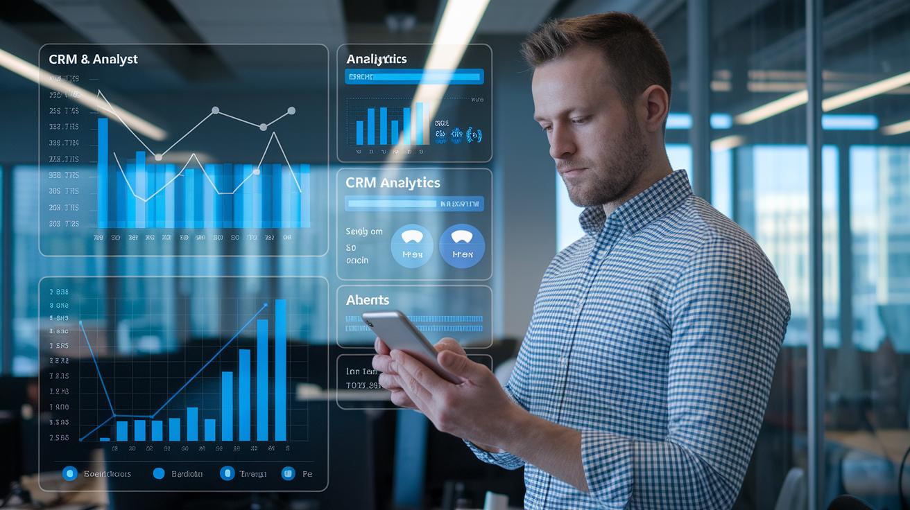
Bringing together data from different systems helps you truly understand what your customers are up to. When you mix info from your CRM, web analytics, or sales records, you get one clear picture that cuts down on mix-ups. Imagine merging data about app activity with in-store purchases, suddenly, trends pop out faster and clearer. And with thorough data checks along the way, every insight feels rock solid.
AI-powered tools take things a step further by transforming your dashboard into a smart decision-helper. Automated reports quickly shine a light on big changes and unexpected patterns get flagged almost as soon as they appear. Picture a dashboard that not only shows you the churn rate but also gives a heads-up when it suddenly shifts, letting you act right away. This shift from just watching trends to predicting them is a game changer for any team.
A straightforward four-step roadmap makes this integration smooth. First, set up a strong base with your core metrics. Then, build a story with segmentation analysis that adds context and clarity. Next, weave in AI to catch patterns automatically, and finally, refine everything with advanced tweaks. This plan turns a jumble of data into a clear, actionable guide that drives smarter customer experiences.
Measuring the Impact of Consumer Insights Dashboards on Business Performance
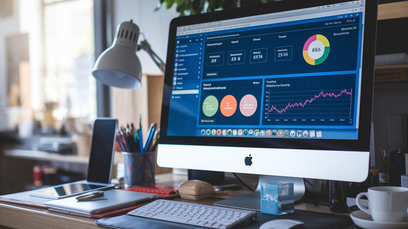
Picture a dashboard that transforms jumbled numbers into clear signs for action. Key visuals and threshold alerts serve as your real-time wake-up calls, think of them as a bright North Star or a bold retention heatmap lighting the way. For instance, if customer churn hits a set limit, an alert springs up, signaling your team to dive in and re-evaluate immediately.
This setup lets teams quickly see which efforts are lifting the business and which are dragging it down. It’s like having a friendly guide that points out both successes and stumbling blocks, helping everyone make faster, smarter decisions.
And there’s more. When data is told like a story, with sharp benchmarks lined up with business goals, it sparks steady improvements. Each visual doesn’t just show trends, it sets a clear target for what’s next. As teams compare past and present numbers, they can tweak strategies on the fly. In simple terms, these dashboards turn cold stats into hands-on insight, pushing every campaign move toward a smarter and more sustainable growth.
Final Words
in the action, the article explored how consumer insights dashboards convert data into clear, real-time insights. It covered effective design methods, smart visualization techniques, and the key steps to integrate data for predictive reporting. The discussion highlighted metric tracking from retention rates to customer lifetime value, ensuring each dashboard supports quick, informed decisions. With AI-driven alerts and a phased setup, these strategies make a real impact. Embracing consumer insights dashboards can boost your marketing effectiveness and lead to even brighter results.
FAQ
What are consumer insights dashboards examples?
The consumer insights dashboards examples display visual storytelling by aligning consumer data with journey stages, making it easier to identify growth drivers through clear charts and metric displays.
What does consumer insights dashboards free offer?
The consumer insights dashboards free version provides a no-cost entry point, offering basic data visualization tools that help marketers review key consumer metrics without a heavy investment.
How do consumer insights dashboards review work?
Consumer insights dashboards review offer honest assessments of platform usability, feature performance, and value by highlighting real-time analytics, AI integration, and visualization clarity for actionable business insights.
How does the customer analysis dashboard by Power BI function?
The customer analysis dashboard Power BI leverages interactive visuals and data integration to merge customer metrics, supporting quick decision-making and revealing trends that drive improved marketing performance.
What is included in customer insights – journeys analytics?
Customer insights – journeys analytics include detailed visualizations of customer behavior, from acquisition to retention, using dynamic heatmaps and performance metrics to guide targeted marketing actions.
What defines a consumer insights platform?
A consumer insights platform unifies and visualizes consumer data, helping marketers track performance indicators and customer trends through actionable dashboards and intuitive reporting features.
What makes a customer dashboard effective?
A customer dashboard becomes effective by presenting essential consumer metrics in clear, interactive visuals that quickly reveal trends and opportunities, streamlining strategic decision-making processes.
How is customer insights – data used?
Customer insights – data refers to the collection and visualization of consumer behavior information, providing strategic, actionable intelligence that supports targeted marketing efforts and business growth initiatives.